I heard a lovely story recently about what was, supposedly, the most succinct literary correspondence ever recorded.
In 1862, Victor Hugo was very anxious to know how the publication of his latest work, Les Misérables, had gone. The writer sent a telegram to his publisher that read simply: “?”
The publisher, delighted that the book had sold over 6,000 copies inside its first week and was already due to be reprinted, replied, with equal simplicity: “!”
You may not be surprised to learn that I have just been reading a wonderful book called HYPHENS AND HASHTAGS: the stories behind the symbols on our Keyboards, by Claire Cock-Starkey. This work is the kind of book that can be dipped into at leisure and provides endless entertainment. I have long been a collector of odd and unusual words and their derivations. Now I can add the punctuation that surrounds them to the oddities hanging around in my brain.
Some people, I know, use punctuation as they would drive a car—get in and go. After all, you don’t have to know how a limited-slip differential works in order to make a vehicle go round a corner. (But you try cornering without one and see how far you get…)
One of the keys on the modern keyboard we use most often is the space bar, but Roman Latin was originally written with no spaces between the words, and all in upper case, as in this inscription in the Colosseum in Rome:

This obviously made reading the text something of a mind-bending exercise. When monks began to copy Latin texts in the sixth century CE, however, they found the lack of any differentiation between the words made the job slow and difficult. Particularly as they were keen to speed up the process, so went from all capitals to a more flowing, lower-case cursive script that meant the quill hardly had to leave the page. This made the words even harder to read until they added dots to indicate the end of one word and the beginning of another, thus:
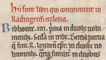
This still left the matter of how to indicate the end of a thought, which in rhetoric was known as a periodus. The monks began using three dots, like an ellipsis turned through 90 degrees, to indicate the end of a sentence. It could also be signified by a high dot, or distincto finalis. The lower-case joined-up text made the placing of the high, middle, or low dots harder to tell apart, so they gradually ended up on the bottom of the line.
When you’re copying out a lot of texts, though, all those dots add up. By the seventh century CE, the monks had realised that a space between words worked just as well as a dot, but required no ink. And a single dot worked just as well to mark the end of a sentence.
By the time Thomas Caxton printed his first book in English in around 1473—his own translation of Trojan Wars history, THE RECUYELL OF THE HISTORIES OF TROY—he tried to be consistent with his punctuation marks. Thus, he had decided upon a solidus, or forward slash, for groups of words. Synaptic pauses were shown by a colon, and both short pauses and the ends of sentences were indicated by a periodus, or full-stop.
In fact, period and full-stop were considered interchangeable terms until about the mid-nineteenth century, when British English went with full-stop, and American English favoured period.
As with all written languages, the use of punctuation shifts and changes over the years. When I was first learning to type a business letter, it had to be done with closed punctuation. In other words, a full-stop after the addressee’s abbreviated title and initial; commas at the end of every line of the address; a full-stop after the post/zip code; and a colon after the salutation. I always preferred open punctuation, even then.
And not because I was worried about ink.
With the internet age, use of the full-stop has become vital in website and email addresses but, ironically enough, it is fast disappearing in emails and social media posts. And apparently in text-speak, use of a full-stop can be seen as an aggressive act of finality.
All that from a humble dot…
–ooOoo–
This week’s Word of the Week is silcrow, which is the § symbol that looks like a stacked double S at the top left-hand corner of a Mac keyboard. It’s also called a sectional symbol, or signum sectionis, and is a typographical character used mainly for referencing individually numbered sections of a document, or citing legal code. On a PC keyboard, hold down Alt and type 0167 on the numeric keypad, or use the Advanced Symbol > Special Characters on the menu bar in Word.